
Watch any hallway between sessions and you will see the same small failure on repeat: two people lean in, squint at each other’s chests, and give up on the name. The conversation starts with “sorry, remind me” instead of a name, and the badge that caused it was probably approved by a committee that only ever saw it full-screen in a design file.
A conference badge is read at arm’s length, on a moving person, in bad lighting. Designing for that situation is the whole discipline, and it decides more than introductions: the same little card is your access control, your wayfinding, and the most-photographed piece of branding at the event.
What a conference badge is for
A conference badge does four jobs at once: it introduces the wearer, it proves they belong in the room, it routes them and staff by role, and it carries the event’s brand through every photo taken that week. Most design mistakes come from serving the fourth job at the expense of the first.
The introduction job is the one with a hard physical constraint. A name that cannot be read at handshake distance has failed, whatever the badge cost. The access job increasingly runs through a scannable code rather than a staff member’s eyes, which changes what belongs on the front. The same rules govern meeting badges for smaller internal events; only the production method shrinks.
What belongs on a conference badge
Order the badge by reading priority: full name largest, then organization and title, then the role band, then the event name, with the scannable code placed where a scanner reaches it without flipping the badge. The attendee’s first name deserves the biggest type on the card, because it is the only element another human needs from across a handshake.

Everything else earns its place or goes. A photo helps door staff match badge to face. A QR code turns the badge into a credential and, at exhibits, into the lead-capture medium booth staff scan. A pronoun line, offered as an opt-in at registration, saves attendees from guessing. The event name and logo belong on the badge, but as the frame, never the headline: your attendees already know which event they are at.
What is the standard size of a conference badge?
The standard conference badge insert is 3 by 4 inches, the format badge holders and stock like Avery 5392 are built around, with six inserts printing per letter sheet. Plastic credentials use the CR80 card format instead, the ISO ID-1 size of a bank card, printed on PVC by card printers.
Bigger is not automatically better, but smaller almost always is worse: shrinking the badge shrinks the name first. Whatever size you pick, the holder, the stock, and the printer have to agree on it before the design is finalized, which is why size is a week-one decision rather than a print-week one.
Conference Tracker
Check people in fast. Prove they were there.
Conference Tracker scans attendees with the phones your staff already carry, tracks time in every session, and issues certificates and CEU transcripts on its own. One conference ran 2,623 attendees across 186 sessions on it.
30+ years building attendance tracking for events and education

Badge material and attachment decide how the badge survives
Match the material to the length and conditions of the event. Paper or cardstock inserts in holders are the budget default for a one-day or indoor event. Synthetic tear-resistant stock survives rain and a multi-day wear cycle. PVC cards survive anything, cost the most per badge, and suit credentials that double as access passes. Recyclable stock and plantable seed-paper badges exist for events with sustainability commitments, and a reusable holder program cuts waste further.
Attachment is part of the design, not an accessory decision. A lanyard badge spins; printing the same face on both sides means the name is never the side facing away. A clip or magnet keeps orientation but dictates where on the body the badge sits, which changes the scanning gesture at doors.
Design rules that survive the hallway
Contrast and restraint beat decoration every time a badge is read in motion. Dark type on a light ground reads; type over a busy photo background does not. One typeface family, two weights, is enough. The event’s brand color belongs in the frame, the band, or the back, while the name area stays quiet.
Give the scannable code its printing conditions: solid contrast, no overlay, and clear space around it, then test it with a phone camera from a real badge, not a screen. Test the whole design the same way: print one sample on the final stock, pin it to a shirt, and read it from handshake distance. A design that fails that test fails the event, and it is the cheapest test you will run all year.
Color coding turns badges into wayfinding
A role color band lets staff read the room at a glance: speakers one color, exhibitors another, staff a third, press a fourth. Door volunteers stop interrogating badges and start scanning for the one color that does not belong, and attendees learn within an hour who to flag down for help.
Registration badges can carry the same logic further, coloring by ticket tier or track so a workshop-only registrant is visibly different from an all-access one. Two cautions keep it honest: color alone is not security, since colors are easy to fake and some attendees cannot distinguish them, so pair the band with a text role label and let the scannable code do the actual gatekeeping.
From design file to printed badge
The design is finished when it prints correctly with real data, not when the mockup looks good. Variable-data printing pulls each attendee’s name, role, and code from the registration list, which is where long names, accents, and double surnames break layouts that looked fine with “Jane Smith” as the placeholder. Test with your longest real registrant name before approving anything.
The production fork is pre-printing against printing at the door, and the hardware determines what your desk can do on opening morning. That decision has its own guide: our comparison of event badge printer options covers the printer classes, the queue math, and rent versus buy.
How Conference Tracker handles badge design
Conference Tracker builds the badge design step into the event platform itself: badges are designed in the account on templates or from scratch, any number of designs, with a default design per conference role so presenters, staff, and attendees each get the right badge without per-person assignment. A design can also be tied to a specific attendee group, which is how a sponsor tier or a VIP list gets its own look.
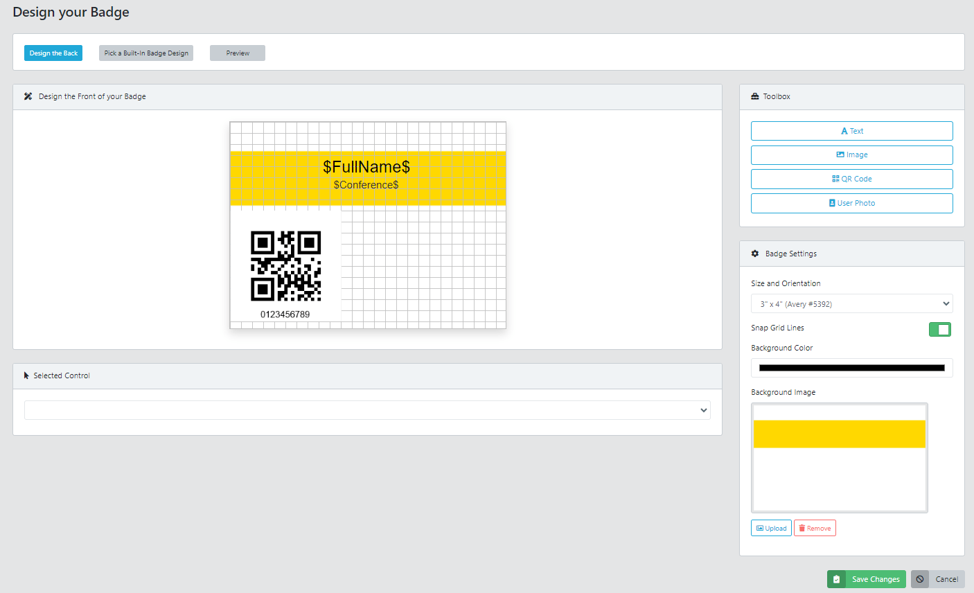
The designer places text, images, the attendee photo, and the QR code on the canvas, with size presets matching standard stock including 3 by 4 inch Avery 5392. The code it places is the credential: it signs the holder in and out of sessions and stays scannable down to 0.8 by 0.8 inches. From there the platform closes the loop between the design file and the door: badges print at check-in in one action, go out by email as one file per attendee, and an attendee who arrives without one is scanned from the electronic badge in the attendee app.
See your own badge design working as a live credential: request a Conference Tracker demo.
The badge test worth running
Print one badge on the final stock with your longest registrant’s real data. Pin it on a colleague. Read it from handshake distance, photograph it from where your door staff will stand, and scan the code with an ordinary phone. Five minutes, four failures caught: type too small, contrast too weak, layout broken by a real name, code unreadable in venue light. Every one of them is free to fix this week and expensive to discover at the door.